
Today we had a team discussion about the presentations each of us did showing our intentions on what we intend to do in each of our trailer segments or what is needed to be added to the powerpoints.
Me - In my presentation I talked about using gothic styled architecture with the interiors with additions of skulls - church of bone , although it did come up that doing the lighting would be difficult to do. The exterior dam would have the addition of toxic waste added to it creating the green glows of toxicity. The characters would have a green hue - again to show they have radiation/toxicity. They would be clad in alot of plate mail armour - goithic style. The second seection of my environments is the oriental areas. In that section characters would have a samurai/oriental amour style and the environment themselves would have a japanese garden style to them.
Harisson - Harisson need to add more about historical weapons to compare witht he modern ones already chosen in his powerpoint and a little more research on the historical art work styles.
Robin - would be working on a futuristic waterworld - atlantis - with gothic and greek art styles, with additions such as pillars/arches. He will make use of tunnels - such as in bioshock, but these tunnels would have a toxic waste/water pouring into them. For the characters they would have a pirate style with the addition of masks that would help them surviv the environment - gas masks, divers masks etc
Corey - will be working on an Egyptian environment - pyramids, statues etc and the characters style would be that of the egyptian gods - ANubis, Seth, Ra etc.
The next step is wokring out how to tie all the environments into one streamlined content.
Monday, 29 November 2010
Thursday, 25 November 2010
Adding Environment Effects
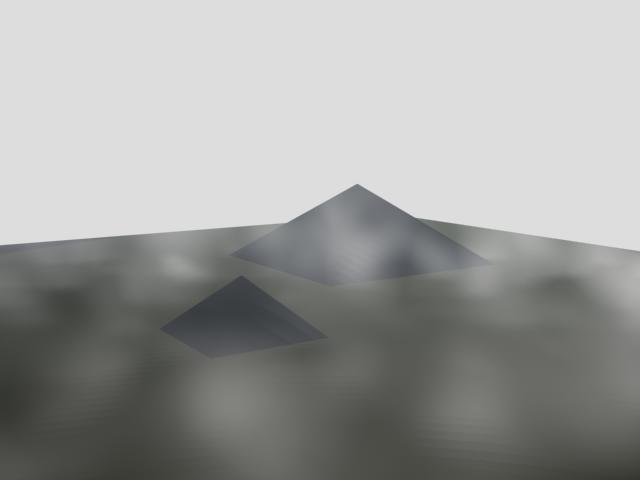
Today I learnt how to add basic environment effects such as fog to an environment I have created. I started by creating a plane and added a couple of pyramids to make a basic environment.

I then added a camera to get a good angle/perspective shots to work on.
To add the environment effects I go to rendering and select environment - I then added Fog and Volume Fog to the enironment.

Below are two examples of effects I have added t the pyramid environment -


I intend to keep on working on the environment effects so I have sufficient skill to add the effects to my main environments for the trailer I am making.
After working on adding Fog and Volume Fog, I then placed a target spot to the environment behind one of the pyramids. I started to change the colour of the lighting and added a lens effect to the spotlight. There are several types of lens effects you can choose from but the two I like combined the most are the "Star" and "Ray" effects. But I have still taken renders of the environment with different coloured lighting and lens effects.


The above image is the one I like the most. This is the render with the "Star", "Ray" and "Glow" effects.
Monday, 15 November 2010
Final Team Logo

This is the final logo for our team. This lgo was decided by vote from all members of the team, but also the votes from the rest of the class. This logo, designed by Harrison won by a total of 9 votes, with the logo designed by me in second place, however due to copyright issues, my logo wouldn't really be useable.
After the votes and the logo was crowned hte winner, the rest of the class gave constructive critisism on how hte logo could be improved. This came in the form of ideas such as combining this logo with the style of logo that Robin made. As well as some ideas on how you could change the font and zombie penguin location.
However it is now up to Harrison as to how he want to improve and change the logo.
My Team Logo

This is the team logo that I designed.
I like the font style anda the way that I added the green cloud effect to make the penguins look like they are radioactive. However the majority of the images used are from the internet and simply edited.
Monday, 8 November 2010
Environments and Artistic Styles
I have recently been making a mood board which will be a major inspiration on the artistic style in my trailer.

I searched the internet and magazines for images that I thought would suit the style of the trailer I am going to make. So the main style of imaes I gathered were of horror, monsters and gore as they seemed the most iconic and influential for what I wanted.
The next part of my task was to take one of the images from my mood board but it had to be of an environmnent. However most of the environment images on the mood board were of confined spaces - corridors, rooms etc. Not suited for what the task would be. Eventually I was forced to look again online to add another picture to the mood board that was a better environment. I came up with this -

This image struck me as being very gothic and dark - suited to my own tastes and styles for my trailer. The showing of old and twisted trees ina graveyard veiled with mist makes for an almost ideal scene for a horror movie or even a horror game. The usage of earthly colours - browns, greys, blacks and lighter colours for the sky add to the mood/feel of the scene.
It was then my task to print this image out and draw it as best as I could.

After I has drawn that image on an A3 sized sheet of paper, I split the image into 4 corners. Each of those sections would then be coloured in a different style. This was to experiment with colours, colouring styles and how each one effects the image. As you can see in the image above, I started using coloured pencils to colour the tree. The whole section would be coloured in a similar colour scheme before I moved on to the next section. The other sections would be coloured in using only standard pencils and shading, felt tip pens and the final section would be coloured with pastels.

In doing the four different colouring styles, I felt that colouring pencils and normal pencils were the most boring of the 4 styles to do. I didn't like doing the felt tip pens as it was difficult to actually colour in without running out of in or making it look bad, so I resorted to using a series of scribbles and lines to colour in the spaces. That in my opinion made it look quite bad and didn't fit in at all with the theme I wanted to convey. The final section of the drawing was done in pastel and I think it was by far the best sectiono f thre four as I felt I conveyed the moonlit night sky quite well and it wolud easily fit in with a gothic scene. I think that if I had done the whole picture in pastels, it would look very good and suit the mood and image well.
In doing this task I have learnt how using different colouring styles and methods to do images effects how they look and change the mood of the image - using lighter/bright and happy colours in a graveyard wouldn't suite my style and needs for what it would covey in my trailer. However if I use dark, earthly colours, the mood of the graveyard would seem dark and gothic - much better in my opinion.
I will take what I have learnt throughout the task and impliment it into the design of my level, both on the level physically and artistically.
Thursday, 4 November 2010
Architecture
Today in my 3D class, I was researching different architectural styles that could either be used in our trailer or give inspirations of things that can be used in the trailer.
I looked at 2 main architectural styles - Gothic and traditional Japanese architecture.
Through looking at many images of gothic architecture, I know that it isn't just stone gargoyles and scary scenes. The Gothic style has alot to do with symetry, lines and repetition. This is most obvious in the use of churches and cathedrals.


Whereas looking at traditional japanese architecture, the buildings are quite angula yet curved as well as being quire ornate in their own way.


By studying the images and how the buildings are designed and appear, these two architectural styles will affect the way I design my environments in my section of the trailer.
Subscribe to:
Comments (Atom)
