
Today we had a team discussion about the presentations each of us did showing our intentions on what we intend to do in each of our trailer segments or what is needed to be added to the powerpoints.
Me - In my presentation I talked about using gothic styled architecture with the interiors with additions of skulls - church of bone , although it did come up that doing the lighting would be difficult to do. The exterior dam would have the addition of toxic waste added to it creating the green glows of toxicity. The characters would have a green hue - again to show they have radiation/toxicity. They would be clad in alot of plate mail armour - goithic style. The second seection of my environments is the oriental areas. In that section characters would have a samurai/oriental amour style and the environment themselves would have a japanese garden style to them.
Harisson - Harisson need to add more about historical weapons to compare witht he modern ones already chosen in his powerpoint and a little more research on the historical art work styles.
Robin - would be working on a futuristic waterworld - atlantis - with gothic and greek art styles, with additions such as pillars/arches. He will make use of tunnels - such as in bioshock, but these tunnels would have a toxic waste/water pouring into them. For the characters they would have a pirate style with the addition of masks that would help them surviv the environment - gas masks, divers masks etc
Corey - will be working on an Egyptian environment - pyramids, statues etc and the characters style would be that of the egyptian gods - ANubis, Seth, Ra etc.
The next step is wokring out how to tie all the environments into one streamlined content.
Monday, 29 November 2010
Thursday, 25 November 2010
Adding Environment Effects
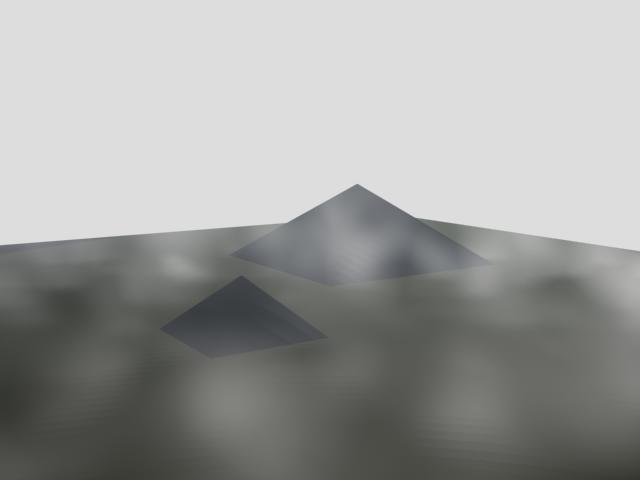
Today I learnt how to add basic environment effects such as fog to an environment I have created. I started by creating a plane and added a couple of pyramids to make a basic environment.

I then added a camera to get a good angle/perspective shots to work on.
To add the environment effects I go to rendering and select environment - I then added Fog and Volume Fog to the enironment.

Below are two examples of effects I have added t the pyramid environment -


I intend to keep on working on the environment effects so I have sufficient skill to add the effects to my main environments for the trailer I am making.
After working on adding Fog and Volume Fog, I then placed a target spot to the environment behind one of the pyramids. I started to change the colour of the lighting and added a lens effect to the spotlight. There are several types of lens effects you can choose from but the two I like combined the most are the "Star" and "Ray" effects. But I have still taken renders of the environment with different coloured lighting and lens effects.


The above image is the one I like the most. This is the render with the "Star", "Ray" and "Glow" effects.
Monday, 15 November 2010
Final Team Logo

This is the final logo for our team. This lgo was decided by vote from all members of the team, but also the votes from the rest of the class. This logo, designed by Harrison won by a total of 9 votes, with the logo designed by me in second place, however due to copyright issues, my logo wouldn't really be useable.
After the votes and the logo was crowned hte winner, the rest of the class gave constructive critisism on how hte logo could be improved. This came in the form of ideas such as combining this logo with the style of logo that Robin made. As well as some ideas on how you could change the font and zombie penguin location.
However it is now up to Harrison as to how he want to improve and change the logo.
My Team Logo

This is the team logo that I designed.
I like the font style anda the way that I added the green cloud effect to make the penguins look like they are radioactive. However the majority of the images used are from the internet and simply edited.
Monday, 8 November 2010
Environments and Artistic Styles
I have recently been making a mood board which will be a major inspiration on the artistic style in my trailer.

I searched the internet and magazines for images that I thought would suit the style of the trailer I am going to make. So the main style of imaes I gathered were of horror, monsters and gore as they seemed the most iconic and influential for what I wanted.
The next part of my task was to take one of the images from my mood board but it had to be of an environmnent. However most of the environment images on the mood board were of confined spaces - corridors, rooms etc. Not suited for what the task would be. Eventually I was forced to look again online to add another picture to the mood board that was a better environment. I came up with this -

This image struck me as being very gothic and dark - suited to my own tastes and styles for my trailer. The showing of old and twisted trees ina graveyard veiled with mist makes for an almost ideal scene for a horror movie or even a horror game. The usage of earthly colours - browns, greys, blacks and lighter colours for the sky add to the mood/feel of the scene.
It was then my task to print this image out and draw it as best as I could.

After I has drawn that image on an A3 sized sheet of paper, I split the image into 4 corners. Each of those sections would then be coloured in a different style. This was to experiment with colours, colouring styles and how each one effects the image. As you can see in the image above, I started using coloured pencils to colour the tree. The whole section would be coloured in a similar colour scheme before I moved on to the next section. The other sections would be coloured in using only standard pencils and shading, felt tip pens and the final section would be coloured with pastels.

In doing the four different colouring styles, I felt that colouring pencils and normal pencils were the most boring of the 4 styles to do. I didn't like doing the felt tip pens as it was difficult to actually colour in without running out of in or making it look bad, so I resorted to using a series of scribbles and lines to colour in the spaces. That in my opinion made it look quite bad and didn't fit in at all with the theme I wanted to convey. The final section of the drawing was done in pastel and I think it was by far the best sectiono f thre four as I felt I conveyed the moonlit night sky quite well and it wolud easily fit in with a gothic scene. I think that if I had done the whole picture in pastels, it would look very good and suit the mood and image well.
In doing this task I have learnt how using different colouring styles and methods to do images effects how they look and change the mood of the image - using lighter/bright and happy colours in a graveyard wouldn't suite my style and needs for what it would covey in my trailer. However if I use dark, earthly colours, the mood of the graveyard would seem dark and gothic - much better in my opinion.
I will take what I have learnt throughout the task and impliment it into the design of my level, both on the level physically and artistically.
Thursday, 4 November 2010
Architecture
Today in my 3D class, I was researching different architectural styles that could either be used in our trailer or give inspirations of things that can be used in the trailer.
I looked at 2 main architectural styles - Gothic and traditional Japanese architecture.
Through looking at many images of gothic architecture, I know that it isn't just stone gargoyles and scary scenes. The Gothic style has alot to do with symetry, lines and repetition. This is most obvious in the use of churches and cathedrals.


Whereas looking at traditional japanese architecture, the buildings are quite angula yet curved as well as being quire ornate in their own way.


By studying the images and how the buildings are designed and appear, these two architectural styles will affect the way I design my environments in my section of the trailer.
Thursday, 14 October 2010
My Ideal Genre For Team Trailer
My ideal ganre for the team trailer would be an atmospheric, horror survival style. This would be in a setting similar to Rapture from the Bioshock series, however our version would be more of a ruined city half flooded so there would be elements of the game set underwater while other sections woud be set on land. This would give the game/trailer a dark, eerie, lonely feel.
The colour pallete for the environnment would be dark, but there owuld also be colour palletes for gore that would be implimented into the game, for example blood reds, flesh colours etc to inicate something bad has happened within the city, not just the flood.


Insane enemies within the game would look like they have been stuck in the ruined city for a long time with tattered clothes or hand made clothes that they have made themselves, similar to Mad Max. The physical appearance of the characters would look disturbing as though they have been exposed to something.
During the trailer itself, the camera movements would appear cinematic in how it moves thorugh the environment giving it a cinematic style.
For the main/playable character, I would prefer it to be a female. I would prefer it this way as it is its a generic cliché that the main character is male. There are only a handful of games where the main character is only playable as a female.
The colour pallete for the environnment would be dark, but there owuld also be colour palletes for gore that would be implimented into the game, for example blood reds, flesh colours etc to inicate something bad has happened within the city, not just the flood.

The art style would be a mix of modern and art deco.


Insane enemies within the game would look like they have been stuck in the ruined city for a long time with tattered clothes or hand made clothes that they have made themselves, similar to Mad Max. The physical appearance of the characters would look disturbing as though they have been exposed to something.
During the trailer itself, the camera movements would appear cinematic in how it moves thorugh the environment giving it a cinematic style.

For the main/playable character, I would prefer it to be a female. I would prefer it this way as it is its a generic cliché that the main character is male. There are only a handful of games where the main character is only playable as a female.
For weapons in the game, the player would have to be rescourceful and find potential weapons within the environment - the game would be heavily melee weapon based howver there would be guns but they would be in limited suply and to be used in extreme circumstances.
Wednesday, 29 September 2010
Radioactive Zombie Penguins pt 3 - Logo Concept Art
After creating our mood board and brainstorm, we started creating concept art besed on what we had learnt and things we had highlighted in the brainstorm. The concept art we have currently done was aimed mainly at drawing the penguin which has yet to be named.

In the first section of concept art we see a few examples of penguin designs, a concept of a cartoon style character with their brin showing, but msot importantly is a good example of a completed logo design which is a potential one we will use after it has been edited a bit.

The second set of concept art shows several designs of the penguin by 3 of the team members, myself, Robin and Harrison. The two larger images of penguins were drawn by Harrison after several other versions were drawn with one of the eyes hanging out. It is that style of penguin that will be used in the final version of the logo.

Again the concept art above is primarily just penguin/zombie designs done by all members of the team each drawn in their own styles.

The final shot is of all the concept art produced so far.
Radioactive Zombie Penguins pt 2 - Mood Board
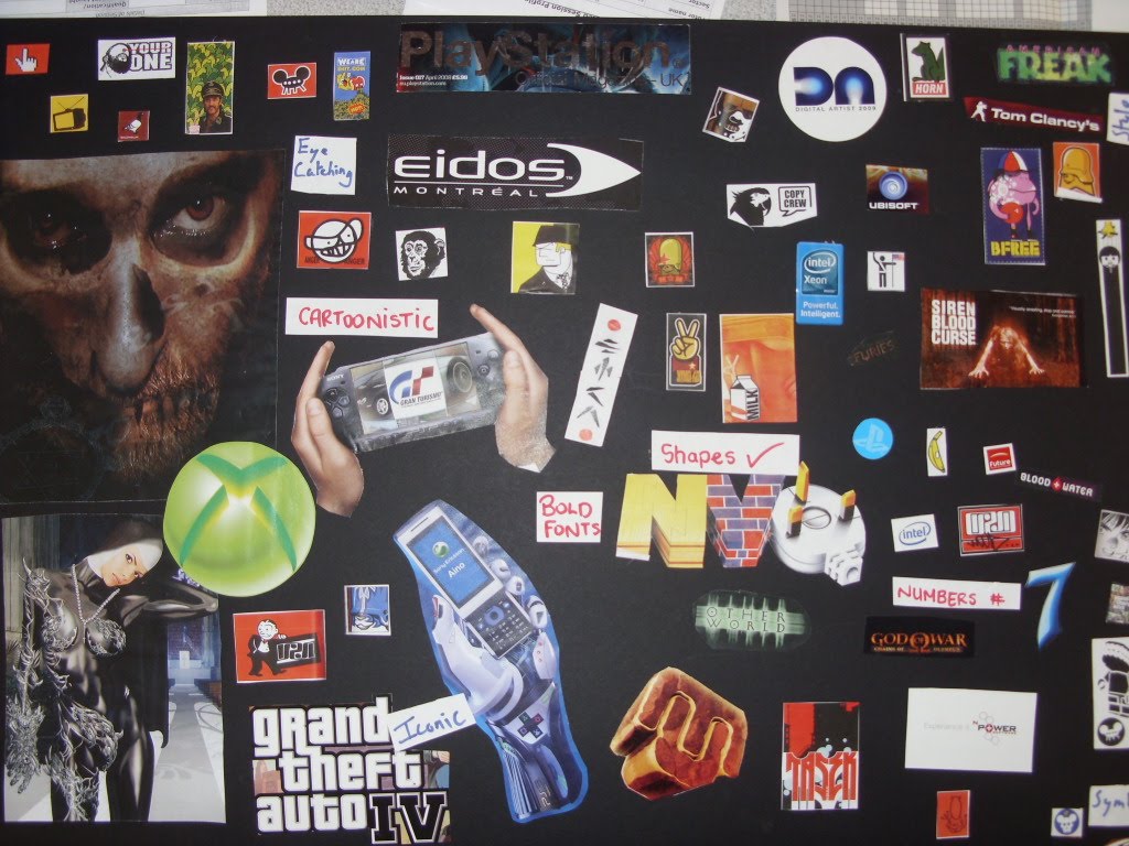
We produced this mood board for inspiration with desdigning our own logo. We went through magazines and several books to find logos, symbols and images that inspired us, from well known logos - xbox, grand theft auto to more styled images such as the nun and the face on the left side of the mood board.
We chose between known logos and general images so we ahd a wider range of things to influence us. I found the images of the nun and the large face because they fit in the horror theme of our name, particularly with the zombie theme.
From this mood board we took several ideas and styles which we later s tarted to sketch out. We took elements of iconic symbols an shapes, horror inspired characters but also the cartoonistic styles of some other well known logos.
On the mood board, next to certain images we put key words about the logos and images t hat make them unique, for example - "cartoonistic", "iconic", "symbolic" and "unique"
Radioactive Zombie Penguins pt 1 - Brainstorm

Our team made this brainstorm to help lay out ideas on our team name, the colour scheme we want to use in our logo. We also lay out ideas on the kind of shapes our logo will be and the shapes it will contain.
The features section we list ideas on the style of imagery we are thinking of using, for example, we want a penguin to be in our logo, use the radioactive symbol as the primary part of our logo. Another feature we wanted to add to our logo was a glow effect to make the zombie penguin more unique.
For the colour scheme, we wanted to use a more earthly palette of greens, browns/reds, yellow, black and white. We chose those colours as we thought it would suit the logo and the overall style we want to achieve.
For the text style and fonts we want to have something that's horror themed, bold and interesting as the text is going to be just as important as the image is.
Thursday, 23 September 2010
Sky Boxes
Today in class we created a new environment so we could start testing out how to make sky boxes. I did the same as in the previous post where I used both photoshop and 3D Max to create my environment

With my environment ready in 3D Max I created a geosphere that completely surrounded my environment. I cut the geosphere in half as the bottom half of the sphere wasn't needed. I moved the sphere on top of the environment.
The next step was to select all the faces of the sphere and flip the normals so the faces pointed inwards. That way when I put a skin on the geosphere, the image will face inwards towards the environment.
Thursday, 16 September 2010
Environment Design
Today I created my first environment, not incuding the one my ship was set in.
Displacement Map
The first step in creating an environment was in Photoshop. I created a new document at 512x512 with 72 pixels/inch. That blank slate creates the base of what I am going to create. The first major step is to then fill the space in black, this will be the lowest points when the environment is put into 3D Max.
I select the brush tool and set the colour as a dark grey and start to brush on where you wan the next level/higher point in your environment. I then repeat the process each time choosing a lighter colour until I choose pure white to be the higest points in the environment and save the file as a jpeg. This is now your Displacement map.
3D Max: Displaceing An Environment
The next step in createing your environment is in 3D Max. I use standard primitives to create a place on which my displacement map will go on, but first I increase the number of length and width segments as this will increase its resolution. I set the segments to 100x100.
After creating the plane and changing the numebr of segments I go onto the modifier list and select displace. From the list of actions available, I click to add a bitmap image and select the jpeg I created in photoshop which is then applied to the plane. By increasing the strength of the displacement, the plane will begin to morph according to whta we did on the jpeg - the lighter sections of the image will rise up while the darker parts will remain low, this will turn into our basic environment.
I then changed the Blur level to smooth out the rough edges to my liking.
Texture Map
The environment looks a little dull at the moment so what we need to do now is add a skin to add colour to it.
We go back to our displacement map in photoshop and create a new save file, this new file will be our texture file. I then add a new layer and select the first colour I want to add, in my case I added a green to go along the "road". After placing the green colour I added noise to the colour and changed the the percentage until I was happy with what it looks like.
I then created another layer and repeated with grey colours to become the mountains and again added noise and changed the levels so they worked well together. After adding all the layers I saw fit, I saved the image as a new jpeg and named it Texture Map.
Adding The Skin
The final step is adding the new skin to the environment. To do that I press M to bring up the material screen, click on displace and click on bitmap. I select my jpeg and drag it onto the environment.
Thursday, 17 June 2010
3D Max Unit 64-65 Evaluation


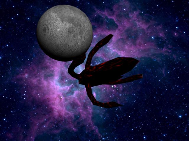
Above are two of hee final renders of my 3D Max project.
I am very pleased with how this project has turned out and at all of the skill sI have learned from doing it in ithe process. I have goen from never using 3D Max to learnign how to create simple shapes to animated space ships, basic environments and skinning the models.
I am very pleased with how this project has turned out and at all of the skill sI have learned from doing it in ithe process. I have goen from never using 3D Max to learnign how to create simple shapes to animated space ships, basic environments and skinning the models.
Over the course of the project, mu shiop desing has changed from its original design plans of being a coffin shaped body with tomb stones and mausoleum attatched to it.The designs have since changed to being still a coffin shaped body, but now, instead of a mausoleum and tomb stones,, they have been replaced by "arms" that reach out of the back of the ship cageing the body of the ship.
So even though the design of the shi may have changed through the course of the project, I believe the overall product has met my intentions of creating a a space ship with a dark/gothic theme and the addition of a moon and planet with the animation was an added bonus to the product.
I started the project by researching defferent ships and creating mood boards with a selection of some of my favourite ships from different tv series but primarily from the sci-fi series Babylon 5.
Once I had researched the different ships and how they look, I chose the theme for my ship and started making sketches of different thigns that could be related ot my ship. In my case I drew thigns such as mausoleums, grave stones, skulls and fangs as an influence. This later influenced the main design sketches I drew of my ship.
I drew the plans of my ship in traditional architect style - front, back, side and overhead views and being in rough scale.
Once I ahd comeplted my designs I follwed them closelsy when I first started in 3D Max but the more I worked on the ship, the more it started to stray from tehe plans - I managed to create a coffin styled body for the ship and created something similar to a tombstone to represent the bridge of the ship. But eventually I decided not to do the mausoleum as upon doing it I found it made the ship look to blocky and simple. Instead I had the idea for the ship to ahve some sort of "arms" reaching out from the with the idea that they would act as weapons or propulsion for the ship.
After much trouble of figuring out how to get the arm to curve out of the body of the ship, I coppied the arms and attatched them to the body of the ship.
Once I had all the ship in one piece and looking lie a basic ship I started to unwrap the model so I could put the mesh into photoshop and create its skin that would cover the model. In most cases poeple would use light colours to make their ship stand out, but I thought that if it was real and it was some sort of military ship, trhe sensible thing to do wuld be to make it harder to see, at least harder to see from a window. So with that in mi nd I chose a darker colour pallete of blacks, dark reds and dark oranges mixed/coulded together to create its skin.
I then saved the new skin and applied it in 3D Max to the model to create my finished ship. However for some reason, it didn't skin quite properly and so there are some places on the ship that don't appear to be skinned properly.
However, witht eh ship itself finished I then went to work on animating the ship. I took a full day and several video tutorials to figure it out, but I eventually got the ship to follow a set path and i then to add something to make it look more interesting in th e background. My first idea was to add a spacestation but that quickly changed and soon became a planet and a moon. I eventually got t he moon to orbit around the palnet too so the ship flies about as the moon orbits the planet.
I also found images online of the moon and several different images of earth. I stuck an image of the moons surface onto the smaller of the planets which would become the moon in my 3D environment. I then went through several maps of earth and tried applying them to the larger planet. But that went wrong and I ended up with a rather large white crack going along the planet, until I found a night time image of the planet. That night time image fit the planet prefectly, and so i had a (nearly) completely skinned ship, a moon and a planet earth complete with animation and nebula background for when I rendered the animation/images.
Throughout this project I have learnt many new skills, boht from a research/design aspect of looking at how the ship would work and its functions, to designing skins within photoshop to be applied on my models and finally to the many and complex controls and options that are available in 3D Max and has left me wanting to learn much more about what I could do with that program.
If I had to do the project again, the only thing I would do different would be to try more of the many options and tools available in teh program and to see how they affect my model.
Wednesday, 16 June 2010
Unit: 67 Reflection
UNIT: 67 GAME TRAILER STORYBOARD


Above aer some of the storyboard/comic layout styles I researched to base my own storyboard on.
For unit 67 we were assigned the tast to produce a storyboard of our own design but we had to include a character from a cartoon/comic somewhere in our storyboard. We were first tasked with researching about how comics/storyboards were made and how they work. This was important to do so we knew how to lay out our storyboards and create our designs based around that. In this research I mainly looked at two main styles of storyboard/comic styles - the western storyboard stlye where it is read left to right and the Japanese style of storyboards/comics where it is read right to left. I found the Japanese style to be the most interesdting of the two as I am quite inot manga and anime. However by the time I finished the my actual product I ended up using the standard western style/layout.
After researching about storyboard layouts I then researched about the character I had chosen to include in my stoyboard - in this case I chose to do Harley Quinn from DC's Batman: The Animated Series. I chose to do that character because she is unique. Her character was created just for the animated series to be a female henchman for the Joker but fans of teh series liked her character so much she eventually ended up with her own animation series, own comic series and was officially included into the canon of the DC Universe.
I researched about her character, the artistic style that was used to creatye her as well as researching about the actual people who were responsible for chreating her character, the reasons why they created her and how they created her - such as who influenced her character etc.
Once I had researched layout styles and how storyboards are used and researched my chosen character I then created my scripts and drew several versions of Harley Quinn in various outfits and poses. Once my script was written and my test drawings were finsihed I chose my layout style and started work on my final product - the storyboard itself.
I started at first by drawing a rough version of the storyboard with basic images to show what was happening. I then i n my own time redid this storyboard and took my time doing the drawings so they were clear and showed whta I wanted but were basic enough that I could easily scan in the sketches into photoshop where I could then colour and edit thm into my final product.
I scanned in my drawings, though I had some technical problems and would only scan in parts of the drawing, but after messing around with it for a while I eventually got it to scan the full page so I could put it all into photoshop.
Once the drawings were in photoshop i proceeded to cut out the frames fromt eh rest of the page and put them onto a blank page in A3 size. I put all frames onto this new A3 screen and proceeded to put them into their order and started to colour then in - line art style.
However while I was doing this - moving the images and colouring them in, I was forgetting to add the colour to the layer that the frame was actually on so i made a mess of things if I decided I wanted to move one of the frames a bit. Even though I made a mess of it that way I think I fixed the storyboard so it didn't go into to much chaos.
During the colouring of the storyboard I used images that I had created myself to also be used in the storyboard. For example, in the scene where you are looking in through the window, on the tv you can see the 3D ship I designed in my 3D class, and during the scenes where harley is fading into view from the TV, the swirling purple background was an image i created in photoshop to be a unique backround for an presentation work I have to do to mark it as my own.
Below is my final version of the storyboard I created in photshop based on my own drawings and with the inclusion of Harley Quinn - my unique character for the storyboard.

Product Review
I feel that my end product matched my original intentions, although the layout is slighytly different due to me messing up on the colouring. However, I my product brief I said I was going to do it manga style where you read it backwards. When it came to me making the product I instead created it in the normal western stlye of storyboards. That was my only major change from my original intentions.


Above aer some of the storyboard/comic layout styles I researched to base my own storyboard on.
Overall I feel my product is appropriate for my target audience - which is every one of all ages, gender and race, however I feel t hat if I were to continue the series it would be aimed more at males in the teenage years and older.. I feel it reaches this goal as there is no graphic content that could cause offence, it has slight humour in it and has fairly well designed chracters in it.
Technical Aspects
Technical Aspects
In the technical aspects I used a scanner to scan in my A3 sketches and used the cut tool to slice out the frames of my storyboard and move htem across into the main screen. From here I used mainly the basic tools and useage of text to create and colour the storyboard. I feel the main amount of technical and artistic aspects came into play in the actyal colouring of the images - even if i was colouring htem in the wrong layers. I feel that the colouring was the best technical aspect during the creation of the storyboard due to the details I went into in the colouring - adding shading to the faces to make it seem more 3D and just look better, I used different opacity levels to achieve this instead of shading just using solid colours that would have looked out of place. I also used the opacity setting in some of the images of Harley to make it appear that she was fading into view in some of the frames each time her form becoming a more solid colour.
Therefore I feel that my artistic skills were the best part of hte project, even though my drawing skill aren't very good, I am still pleased with how the images turned out, especially the close up shot of the punk looking girl.
As stated previously the only problems encountered when making the storyboard, other then the technical issues with the scanner, were forgetting to change to the correct layer when I was colouring. This led to problems when I wanted to move the image later. I resolved this issue thoguh by designing the storyboard around it so it didn't look as bad as it could have been.
The main thing I have learnt from doing this unit is improving my drawing skill but more importantly - REMEMBER TO USE LAYERS CORRECTLY!
As just said above, I believe through this project, I have built up more skills in photoshop as well as slowly starting to improve my drawing skills which is something I definately want to improve throughout this course.
I believe I have met the deadline and had little problem with time management, except when I had technical problems such as corrupt usb's and my computer breaking.
Finally, overall I am happy with how my product turned out. Though I feel that it could have looked better if I hadn't donet he colouring in the wrong layers. Therefore if I had a chance to do it again, I would take much more care when I'm colouring to maske sure I'm doing it on the correct layers and to space out the storyboard so it doesn't look such a mess.
Thursday, 20 May 2010
3D Video
Here is the first video clip I have made of my 3D ship. This is just a test video to figure out how things work.
Final Ship Renders
I finally finished making all of my ship, skinning it and setting it for animation. I am quite pleased with how the final nproduct has come out. All that I need to do now is record the animation.


Thursday, 22 April 2010
Thursday, 4 March 2010
Multi/Sub-Object colouring
Using Multi/Sub-Rendering I took a blank coloured robot I had created and used the simple colouring technique to add the colour to it. I opened the materials menu and set it to multi/sub-object and set up 4 different colours. I set the names of each material for a specifi part - ears, mouth, eyes and body and assigned the colours to them.


On the actual model I then selected the faces I wanted to colour and assiged then to the releven ID number for the material - Eyes was ID 1, Mouth was ID 2, Ears 3 and Body 4. Once I had selected and assigned the correct ID's to the body parts I dragged the material onto the model to colour it.

Development of Ship


Since my last post about my 3D ship. I have continued to work on it. In the last post, the ship looked very simple - just a box carefully extruded into the shape of a coffin with a small cockpit.
But as you can see changes ahve been made. On the actual body of the ship I extruded a panel out on each side to act as fins. But the msot noticable thing on the ship are the four "arms" that come out of the ship. The inspiration behind those was from the Vorlon Warships from Babylon 5.


Subscribe to:
Posts (Atom)
